• When you click on links to various merchants on this site and make a purchase, this can result in this site earning a commission. Affiliate programs and affiliations include, but are not limited to, the eBay Partner Network.

Where to place my 1970 Superbird style "Plymouth" decal?

Dibbons

Well-Known Member
Local time
11:25 PM
Joined
Nov 29, 2014
Messages
4,812
Reaction score
5,653
Location
La Paz, B.C.S., Mexico
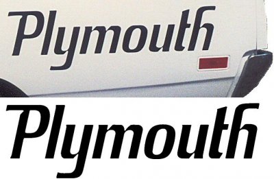
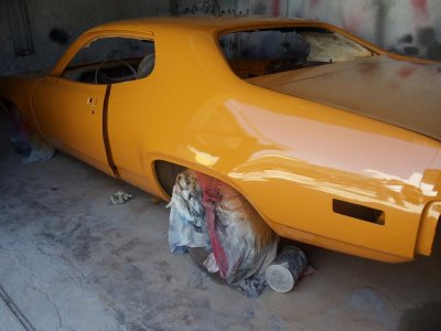
For my 1972 Plymouth Satellite Sebring Plus project, I need to apply some identification graphics so the public will know who manufactured the car they seem to like so much. I have the Superbird style quarter panel decals on the way. I have seen them mid-way over the rear wheel wells or further back closer to the rear bumper. Are there other (more original) ideas out there? Thank you.
 

Attachments

  • Superbird_Quarter Decal.jpg
    Superbird_Quarter Decal.jpg
    47.4 KB · Views: 1,660
  • DSC00373.jpg
    DSC00373.jpg
    46.4 KB · Views: 535
I wish I could help you out - just wanted to say she looks sweet.....
 
wherever looks good, cause its not a superbird
 
No, it is not a Superbird, but my plan is to make into into a "Super Satellite". Check out my avatar or build thread, "Project Odyssey" for more details.
 
If you are going along like this car, that's where I would put it, this one looks pretty bad ***!!!

77459205f89494623dcd52d66baa7839.jpg
 
I always put mine with the base of the lettering on the detail line of the fender, and aligned with the end of the marker light. I put these on all my Roadrunners since they are the best way to fill up all the space back there and balance the rear detail with the front.

CAM00052.jpg


I think the most important thing is make sure that sucker is straight! Nothing looks worse than when those are put on crooked. Also, make sure to use a true Superbird decal instead of one of the smaller Plymouth decals some vendors sell. The smaller ones look too weak.
 
Those two previous suggestions both look sharp. Being the fact there is no plan to add strobe stripes or any other graphics, I am leaning toward the blue example above for my project.
 
It looks like the decal on the blue car is aligned with the wheel well opening and centered over it. I think that puts the decal too far forward, but the important thing is that it aligns to something to pull the look together. :)
 
Lol I think we think alike, I wasn't gonna put mine on until the color sand is done this winter, I was going to set mine far back, closer towards the rear bumper.
 
I've found that graphics look more purposeful the more you can align them with something. If they aren't aligned with something, it looks like you just stuck them on. That's why I align with the marker lights and the accent line, or the other guy aligned with the wheel well. If you go too far back, there's nothing to align to as the angle of the lettering doesn't match the angle of the rear of the fender and/or trunk.
 
Auto Transport Service
Back
Top